I use Google all the time to try to find answers for the many many things I don’t know. The “auto-complete” nature of the search interface in itself worthy of investigation …

… but I’m going to focus on the “answer” that gets highlighted and shown at the top of the results when you search for a specific question (the Featured Snippet). I taught a series of lectures during summer school where we used Google question/answer scenarios as inspirations for in-lecture investigation and in this post I’ll talk about one of these investigations.
What’s in a name?
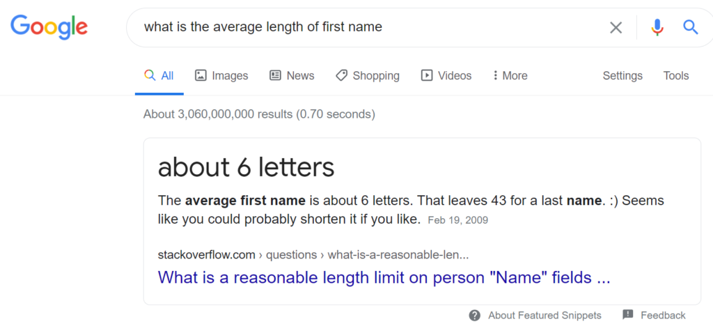
The question/answer scenario used for this investigation is shown below:

After showing this Google result with students, we discussed investigating the “answer” provided by Google using students in the lecture. At this point in the course, we had not carried out a one sample t-test on a mean, so this activity also served as an introduction to this method.
After discussing the parameter (the mean length of first names for students in the lecture), the null hypothesis (µ = 6) and the alternative hypothesis (µ ≠ 6), I then asked students to discuss with each other how we were actually going to take a random sample of students from those sitting in the lecture theatre. One suggestion was that I could number everyone in the room (around 120 students) and then generate random numbers to select the sample.
Another suggestion was to use the ID number that each student is assigned when they login into Qwizdom QVR (an audience response system). We talked about an issue with using this approach – that only 56 students were logged in at this point in the lecture. Using this approach, the sampling frame would not match the population and we would have selection bias.
So we went with a sampling approach based on what day of the month a student was born. I explained I would generate a random number between 1 and 31 and then whoever was born on this day would be part of the sample. I asked students what I was assuming by using this method of taking a “random” sample and what the limitations were. I then showed my students data from Stats NZ based on births in NZ during 1980 to 2017 and we discussed the fact that not all the months have 31 days!
I then opened up a new Google sheet to record the sample data and demonstrated the use of the randbetween() function to generate random numbers between 1 and 31.

This was supposed to be a quick activity but it ended up taking ages to get a sample of nine students! There were around 120 students in the room, so I was expecting around four students per birthday randomly generated. But I found that as I generated random numbers and asked how many students were born on this day, students were reluctant to volunteer! While this part took longer than expected, it did provide a great opportunity to talk about other sources of bias in the sampling process.
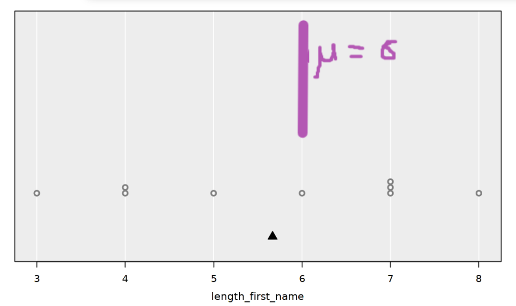
I then imported the data into iNZight Lite and compared the sample mean to the hypothesised value by annotating this value (μ = 6) using the Web Paint chrome extension.

After visually assessing how different the sample mean was from the hypothesis mean (pretty close), I demonstrated using iNZight Lite to carry out a one sample t-test. Last summer when I used the same activity, I made the mistake shown below – can you spot it?

I realised I had not changed the null value for the test from 0 to 6 when I looked at the test results (recreated below using this summer’s results).

Again, this was a good opportunity to turn a mistake into a worthwhile discussion about how we need to “sense check” output. The t-test statistic has the wrong sign (it should be negative), the p-value is way too small based on our visual comparison and the sample size (not much difference and a sample size of 9) and of course the output shows hypotheses that do not match what was discussed at the start of the activity.
This time around, I didn’t make this mistake but maybe I should have intentionally! The correct t-test output is shown below:

This gives us no evidence against the null hypothesis that the mean length of first names for students in the lecture is equal to 6. We also interpreted the confidence interval to reinforce the important idea that our conclusion from this investigation was NOT that the mean length of first names for students in the lecture is equal to 6. We still don’t know what the value of the true mean is – that’s why the 95% confidence interval provides a range of plausible values for the mean length of first names for students in the lecture (in this case, 4.3 – 7.0).
We finished this activity by discussing the difference between our population (students in the lecture) versus the implied population for the Google “answer” (everyone in the world?). Next time I use this activity, I want to extend it to explore what data the average name length claim is based on (I’m thinking it’s the US) and whether first name length varies by country.
Carrying out statistics investigations live in lectures means being prepared for things not to go exactly to plan. There’s also the potential for anyone – including the teacher – to make mistakes along the way. To me, this is worth the risk and helps to create an open and inclusive learning environment.
Anna is a Lecturer in the Department of Statistics, University of Auckland.